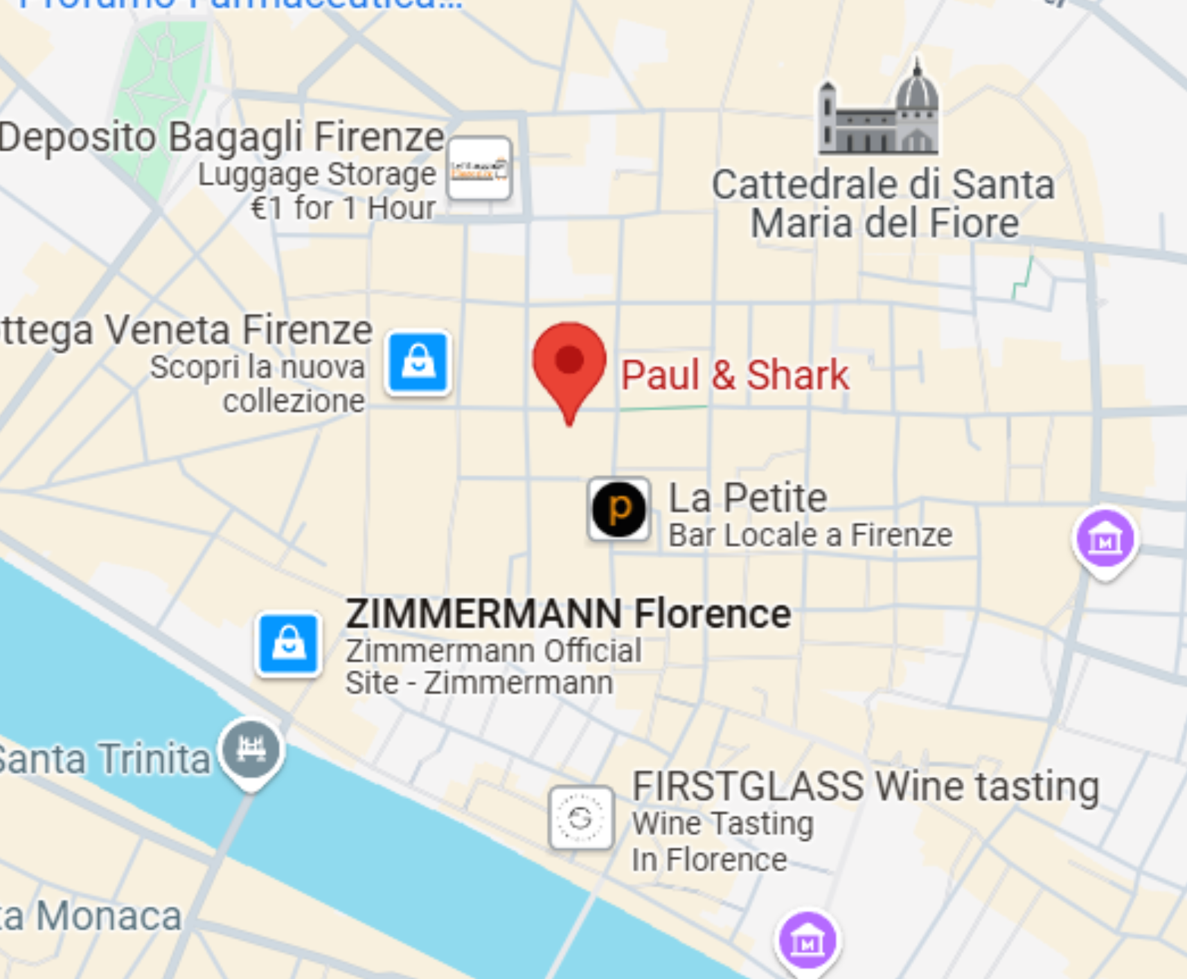
Florence, Italy
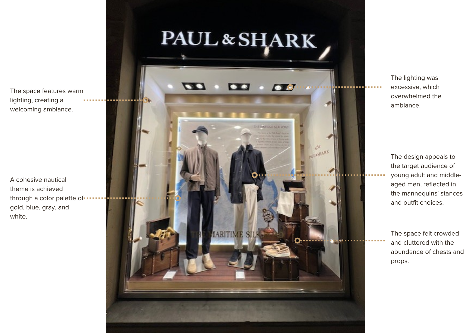
This retail display design project focused on the critical analysis and redesign of an existing storefront in Florence, with the goal of enhancing visual clarity, storytelling, and brand alignment. The selected site was the Paul & Shark boutique located on Via degli Strozzi, a prominent retail street that attracts both locals and international visitors. The original display successfully reflected the brand’s nautical identity through materiality and color, but it felt visually crowded, with an abundance of props and overly bright lighting competing for attention. These factors resulted in a cluttered presentation that diluted the impact of key products and weakened the overall narrative.
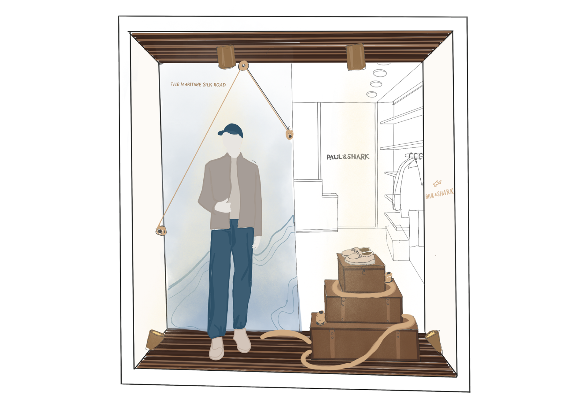
The redesigned concept reimagines the window as a more refined and balanced composition by introducing a semi-closed display system. This approach maintains visual permeability into the store, allowing passersby to glimpse the interior while still establishing a distinct focal scene. To remain authentic to Paul & Shark’s maritime heritage, the design centers on a storytelling backdrop inspired by the Maritime Silk collection. The backdrop evokes a sense of movement and oceanic depth, reinforcing the brand’s connection to luxury performance and seafaring culture. A single mannequin is positioned in front of this backdrop, acting as the primary visual anchor and guiding the viewer’s eye through the display.
The secondary portion of the window features a curated pedestal arrangement composed of stacked nautical chests. These elements serve a dual purpose, functioning both as sculptural display components and as platforms for showcasing shoes and accessories. By reducing the number of props and organizing them vertically, the redesign creates a clearer hierarchy and introduces negative space, allowing each product to be read individually. The chest forms subtly reference travel and maritime storage, further supporting the brand narrative without overwhelming the composition.
Lighting was strategically reworked to enhance depth and focus within the display. Warm, directional lighting highlights the mannequin and pedestal elements, creating contrast against the backdrop and drawing attention to the featured products. This adjustment replaces the previously excessive lighting with a more intentional approach that reinforces a welcoming atmosphere while elevating the perceived quality of the merchandise. Overall, the redesigned window offers a more cohesive, engaging, and brand-driven presentation that balances storytelling with restraint, resulting in a display that feels both luxurious and visually legible.
Accademia Italiana, project for Window Display Design, instructor Rosalba Romanelli
Completed 02/10/2025.